If you’ve talked anything market related with me, you no doubt know I love charts. I think you can learn so much and increase your understanding from them. Here are four charts I’ve been looking at recently that I felt I needed to comment on.
Chart 1 - This Is Painful But Normal
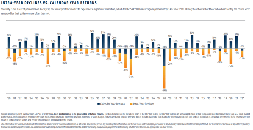
As of Thursday, May 12, 2022 the market continues to pullback from its highs. May’s inflation number came out higher than expected but slowed month-over-month (a good sign). Earlier this month, the Fed continued to raise rates but it remains to be seen if that will slow down inflation. I’ve often said that even though inflation is high so is consumer spending (another good sign). This chart shows that a market pullback of this magnitude is normal. In the 42 years since 1980, the S&P 500 has been down 10%+ in 23 of those years (55% of the time). Only 9 of those 42 years (21%) ended the year in negative territory.
Chart 2 – QQQ % Off High
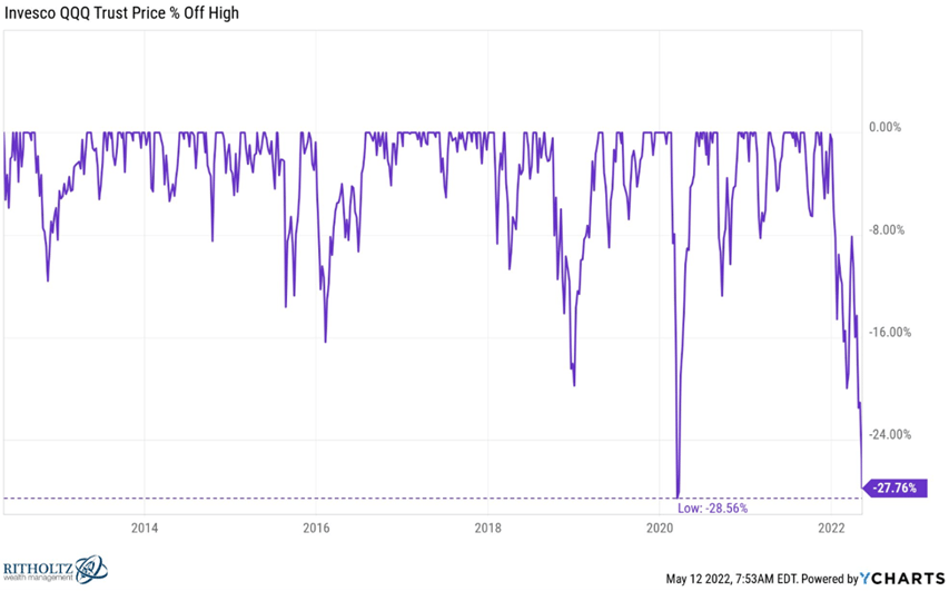
QQQ is the ETF representing the Nasdaq 100 index. If it falls more than 0.8% today (typing this on Thursday, May 12, 2022), it will be in its largest drawdown going back to the Great Financial Crisis of 2008-2009. The three largest constituents in the Nasdaq 100 are Apple, Microsoft, and Amazon. Apple is 19% down from its all-time high (ATH). Microsoft is down 21% from its ATH. Both of those are nothing compared to Amazon, which is down about 41% from its ATH. Apple has $62 billion in cash on their balance sheet, Microsoft has $130 billion and Amazon has $96 billion. In the first quarter, Apple posted an all-time revenue record of $123.9 billion and Microsoft’s revenue increased 22% at $45.3 billion. Amazon’s results were below expectations (or maybe expectations were wrong) but below the surface, Amazon’s AWS (Amazon Web Service – their cloud infrastructure) grew 37% year-over-year and now has close to a 33% market share in the cloud space. All that to say, these aren’t “fly-by-night” companies where the story of their product/service draws investor attention. These are legit, financially sound companies.
Chart 3 – A Terrible Year for Bonds
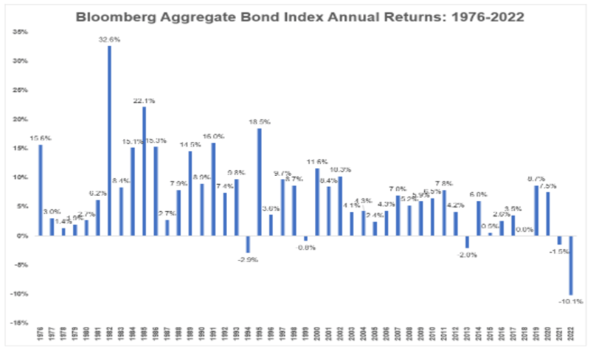
The Bloomberg Aggregate Bond Index was started in 1976 and is a representation of the US bond market. The worst calendar year return since its inception was a loss of 2.9% in 1994. As of right now, the index is down 10% since the start of this year. When interest rates increase, bond prices fall. Most investors figured interest rates would rise this year but I don’t think many were expecting this large of an impact on the bond market. Is there any silver lining here? Maybe. At least the yield on bonds and bond funds will be higher than they’ve been for the past several years.
Chart 4 – Mortgage Rates
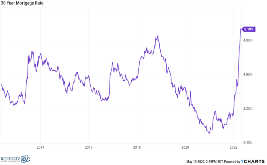
This is one of the most remarkable charts I’ve seen in some time. This upward move in mortgage rates happened so fast that I feel like homebuyers haven’t had enough time to consider how this could impact prices, supply, and demand for housing. Home prices have skyrocketed over the past few years thanks to low supply and demand from buyers. Will these higher rates abate demand? We will have to see. On another note, if banks have increased lending rates this high this fast, shouldn’t they be paying more on their savings/CD accounts? Everyone complains about price-gouging at gas stations but isn’t this kind of the same thing?
Avoiding Water Damage Losses
When it comes to water damage losses, no season is safe as they can happen at any time. Each home comes with potential for water damage losses from pipes bursting to faulty construction and plumbing...
Understanding Credit
It’s difficult to imagine functioning in today’s world without credit. Whether buying a car or purchasing a home, credit has become an integral part of our everyday lives. Having easy access to...
5 Ways To Save For Your Next Vacation
For many of us, last week was fall break. And many are already dreaming about their next vacation. October is Financial Planning Month, and I want to help you financially plan for your next vacation...
Four Chart Friday With Ryan McDaniel
If you’ve talked anything market related with me, you no doubt know I love charts. I think you can learn so much and increase your understanding from them. Here are four charts I’ve been looking at...